


Which Pantone Guide Do I Need for Packaging Design?
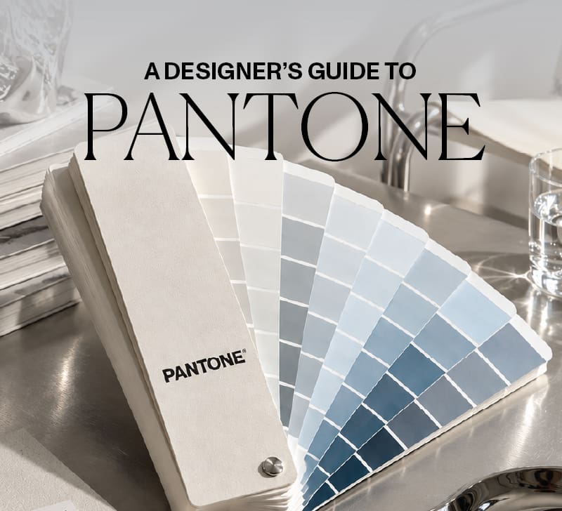
If you’re moving from brand design into CPG packaging design, one question comes up again and again: which Pantone guide should I buy for packaging? A physical Pantone guide is one of the first tools I recommend investing in, but you don’t need all of them.
It can feel like a serious purchase, so here’s my short answer!
I use the Pantone Formula Guide, and for most studios it’s the exact place to start!
It’s straightforward, reliable, and has served me throughout my career in brand and packaging design. There are more comprehensive options to try, when it comes to choosing Pantone guide in packaging designer— I’ll explain those below — but you don’t need to own every Pantone product before you can start designing packaging.
A quick comparison
| Guide | What it gives you | Best for | Buy first? |
|---|---|---|---|
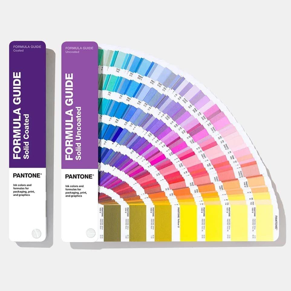
| Formula Guide (Coated + Uncoated) | 2,300+ Pantone spot colours with their ink formulations, on coated and uncoated paper | Specifying and approving spot colours for print | Yes — start here |
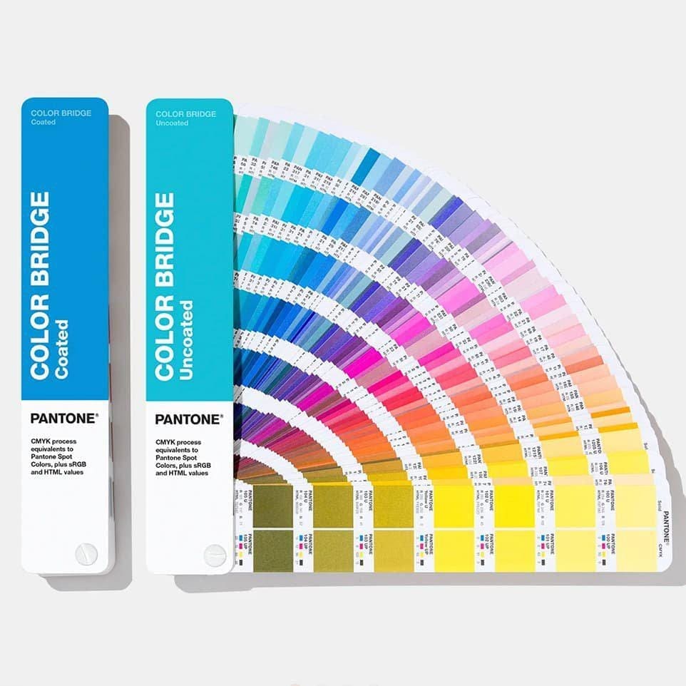
| Color Bridge (Coated + Uncoated) | The same spot colours, each shown beside its closest CMYK, HEX and RGB equivalent | Seeing how a spot colour will translate into process (CMYK) printing | If budget allows |
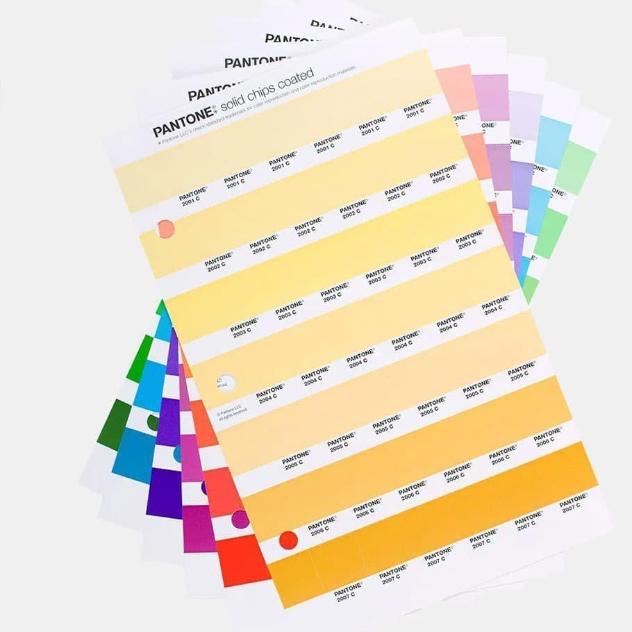
| Solid Chips | Individual, often removable physical colour samples | Comparing combinations and approving colour with clients | When you work in packaging regularly |
| Pastels + Neons | Specialist soft and fluorescent spot colours | Projects that specifically need them | Only when the work calls for it |
Why packaging design needs Pantone guides
One of the biggest shifts when you move from designing for screens into packaging is learning to think about physical colour.
The colour you see on your monitor isn’t necessarily the colour that gets reproduced in print. Screens display colour using RGB light, whereas printed packaging may reproduce colour using CMYK process inks, Pantone spot colours, or another method agreed with your printer or manufacturer. A physical colour reference gives you something tangible to work from rather than relying on what you see on-screen.
Inside my own process, I use Pantone references to establish what I call a Match-To: a physical target colour that communicates the intended result when artwork moves into production, so nothing gets lost in translation between screen and shelf.
Coated vs uncoated — do you need both as pantone guides in packaging design?
You’ll see Pantone colours written with a C (coated) or U (uncoated) after the number, for example 185 C and 185 U. Coated stock is glossy; uncoated is matte. The same ink looks noticeably different on each, because uncoated paper absorbs more ink. That’s why the sets include both references — so you can pick the number that gives you a true visual match on the stock you’re actually printing on. For packaging, where you might work across both finishes, having the pair matters.
1. Pantone Formula Guide — my everyday recommendation
This is the pantone guide I use most when working on packaging design. It’s a fan-book of Pantone spot colours and their ink formulations, available as a Coated and Uncoated set. It’s practical and reliable, and for most designers building a packaging toolkit, this is where I’d start. If you only make one initial investment in a Pantone system, make it this one.
Take a look on Amazon.
2. Pantone Color Bridge — for comparing Pantone and CMYK
Think of the Color Bridge as the Formula Guide’s more sophisticated sibling. Its most useful feature is showing a Pantone spot colour beside its closest process-colour reproduction, plus HEX and RGB values. Why does that matter? Because not every packaging project is produced using Pantone spot inks. Sometimes you need to understand how a colour will translate when it’s printed in CMYK instead — and seeing that comparison physically is invaluable when you’re making colour decisions or discussing options with a client or printer. (Worth knowing: CMYK can only approximate many spot colours, so the Bridge is as
much about managing expectations as matching them.) Take a look on the official Pantone site.
If your budget allows, it’s an incredible addition. If it doesn’t, don’t panic — I’ve worked very happily with the Formula Guide alone.
3. Pantone Solid Chips — for physical colour decisions using pantone guides in packaging design
A chip system lets you work with individual physical colour samples rather than a fixed fan deck. You can place colours alongside one another, compare combinations, and — with removable chips — hand a colour direction to a client to approve. For anyone working regularly in packaging and physical brand design, this becomes a genuinely useful studio tool. But you don’t need your entire dream toolkit on day one! Start with what you need and build from there.
Take a look on the official Pantone site.
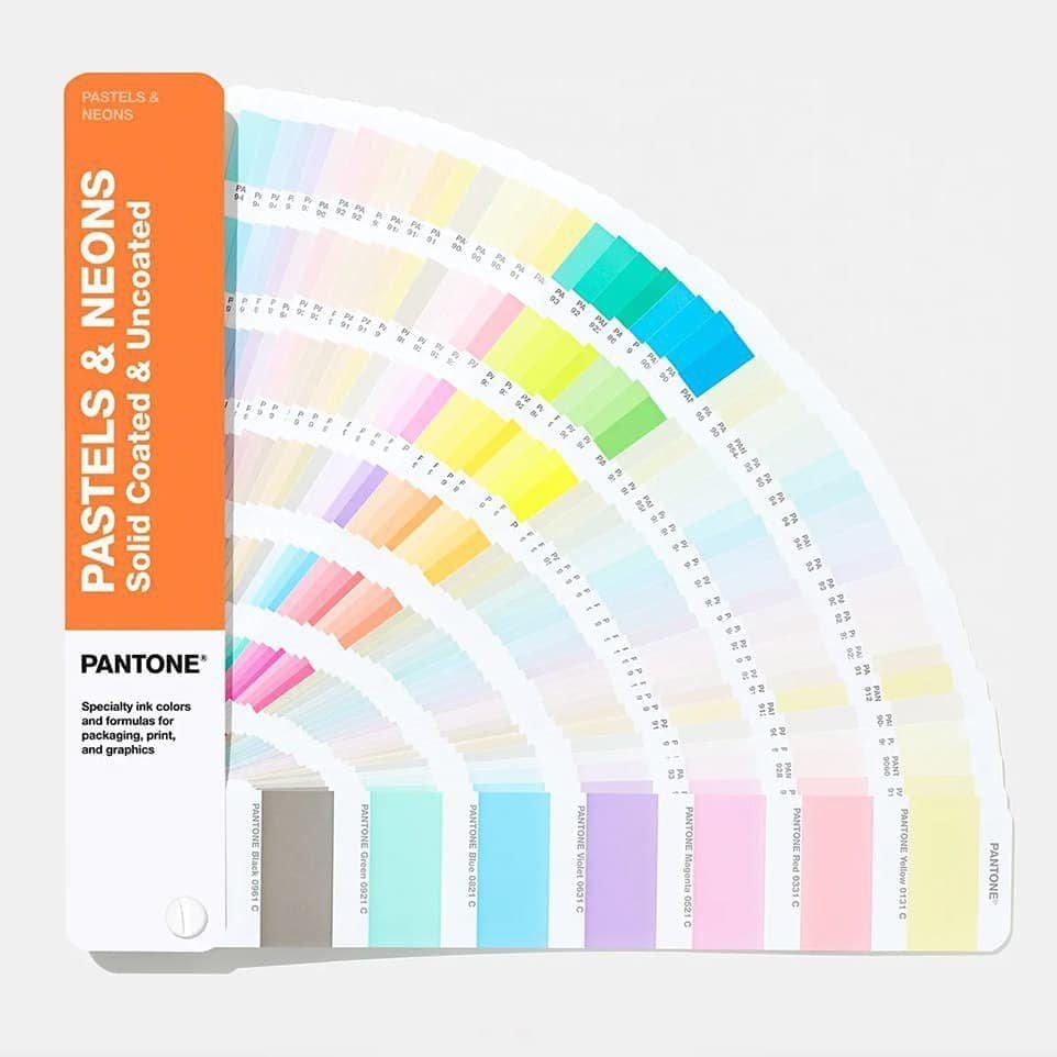
4. Pastels + Neons — useful, but specialist
I reach for Pantone’s specialist guides when a project calls for them. Pastels help when you’re chasing softer physical colours that are hard to judge on-screen, and fluorescent spot colours open up effects that standard CMYK printing simply can’t reproduce. Useful tools — but unless your work regularly needs them, I wouldn’t make these a first purchase.
Take a look on the official Pantone site.
So which Pantone guide should you buy first?
If you’re building your packaging toolkit from scratch, my recommendation is simple: start with the Pantone Formula Guide (Coated and Uncoated). Then, as your packaging work grows, decide whether the Color Bridge, a chip system, or specialist libraries would genuinely improve your process. The point isn’t to own every tool — it’s to become more confident making physical design decisions.
Because packaging doesn’t end when the artwork looks beautiful on your screen. It has to survive the journey from idea → artwork → production → shelf → hands. Learning to understand colour in the physical world is one small but important part of becoming the designer who can confidently lead that journey.
FAQ
Which Pantone guide should a beginner buy first? The Pantone Formula Guide (Coated and Uncoated set). It covers spot-colour specification for print, which is what most packaging work needs, and it’s the most versatile single purchase.
What’s the difference between the Formula Guide and the Color Bridge? The Formula Guide shows spot colours and their ink formulas. The Color Bridge shows those same spot colours next to their closest CMYK, HEX and RGB equivalents — so you choose the Bridge when you need to know how a colour behaves in process printing or on screen.
Do I need both coated and uncoated? For packaging, yes — the same ink reproduces differently on glossy (coated) and matte (uncoated) stock, and the paired set lets you match colour accurately on whichever you’re printing.
Are Pantone guides expensive? A set is a meaningful investment (roughly a few hundred pounds, depending on the guide and retailer), which is exactly why I recommend starting with just the Formula Guide rather than buying everything at once. Prices vary, so check a current Pantone stockist.
Do Pantone colours fade or expire? Yes — the ink on the swatches shifts over time with light and handling, so guides are generally replaced every year or two if you’re using them for critical colour approval.
That physical-colour confidence is what we teach inside Studio Expansion: Brand & Packaging Design.


