The Shelf Study: A 20-Minute Exercise to Train Your Packaging Design Eye
Packaging design for shelf appeal isn’t something you can fully understand from a Pinterest board, Behance project or beautiful mock-up.
The best cpg and packaging designers don’t just look at more packaging for inspiration. They study how it behaves in the real world. Packaging has to work in context: surrounded by competitors, viewed from a distance and navigated by a real customer in a matter of seconds.
One of the simplest exercises I recommend for brand designers learning packaging is something I call The Shelf Study: spending 20 intentional minutes analysing one product category in a real retail environment.
It helps you develop your eye for hierarchy, shelf appeal, product navigation, typography, colour and the small decisions that determine whether packaging gets noticed or gets lost in the sea of same.
You don’t need a real project to start practising it.
The Shelf Study is a practical packaging design exercise for graphic and brand designers who want to develop their understanding of retail first packaging and cpg branding. It involves studying a single product category in-store to analyse shelf appeal, information hierarchy, category codes, product navigation, materials and packaging structure.
Why shelf appeal matters in packaging design
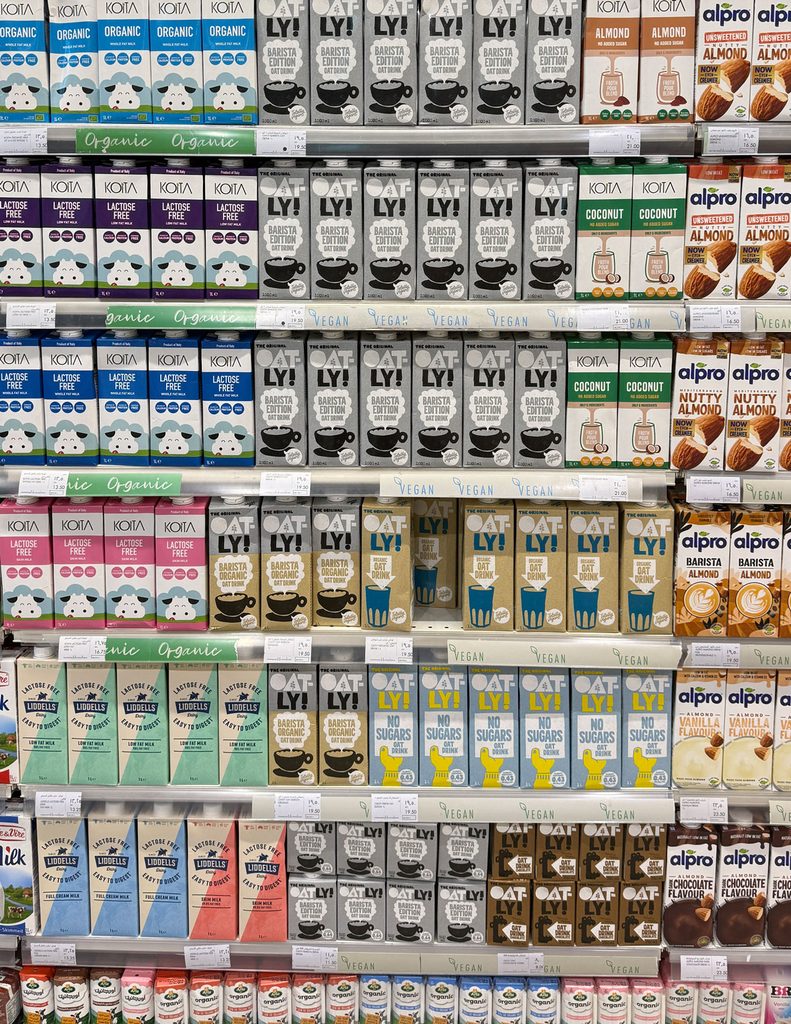
Packaging isn’t designed in isolation; a beautiful piece of packaging can look incredible on your screen turn to mush when when placed amongst 30 competitors on a busy high street store/
Something that feels subtle and sophisticated in at home or on your laptop in Bali might look very different IRL. Even a small decision that seems insignificant on your screen might be the thing that helps a customer distinguish one flavour or product from another.
When you’re designing packaging for shelf appeal, context changes everything. You aren’t only considering whether the individual pack looks good. You’re considering how quickly it communicates, what attracts attention, what a customer understands from a distance and how the product behaves amongst everything surrounding it.
So part of learning to design packaging well is learning to observe it where will perform.
How to do The Shelf Study
We carry out The Shelf Study with every project at Our Kind. Give yourself around 20 minutes and choose one product category to focus on.
Coffee, Chocolate,Skincare, Pasta,Wine,Supplements are my favourites to study, but it doesn’t truly matter what you choose. What matters is resisting the urge to simply decide which packaging you think is prettiest!
Instead, start analysing why things are working.
STEP 01 — Stand back
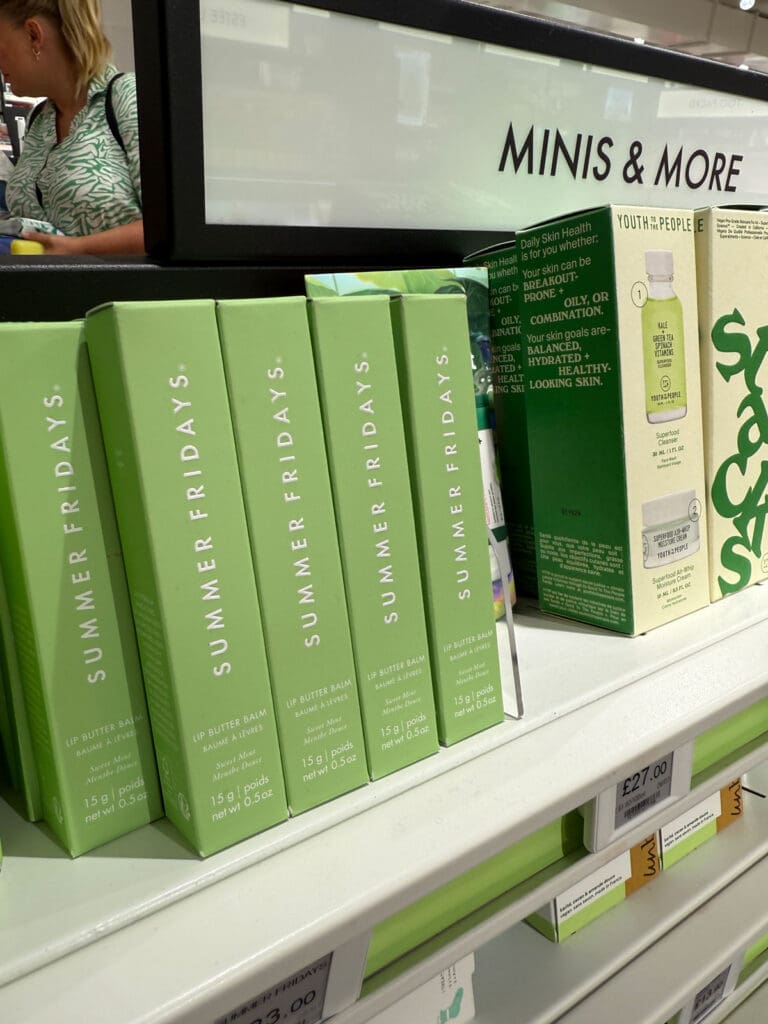
Before you start picking things up, look at the shelf from a distance.
Ask:
What catches my eye first?
Then:
- Which brands seem to blend in?
- What can I understand from afar without needing to read the small print?
- Which products feel immediately different from their competitors?
- Where does my eye naturally go?
- Which brands create ‘blocks’ of colour or pattern?
You’re doing this with the experience a customer has, instead of the close-up view a designer has while working on an artboard in Illustrator.
This is one of the simplest ways to start understanding shelf appeal: to see what grabs attention before a customer has consciously decided to investigate a product.
STEP 02 — Study the information hierarchy
Move closer and look at how each brand communicate it’s message.
Ask:
What am I being told first, second and third?
Look for things like:
- Brand name
- Product name
- Variant or flavour
- Key benefit
- Product descriptor
- Claims
- Size or quantity
- Supporting information
Notice what has been deliberately made dominant and what jumps off of the pack. Packaging doesn’t give every piece of information the same hierarchy and this part of the mastery of design: to pull attention to the right place at the right time.
And when you’re designing packaging for a retail shelf, that hierarchy is incredibly important because the customer isn’t studying an artboard. The design has mere seconds to communicate what the product is and why they might care.
STEP 03 — Look at how the category communicates
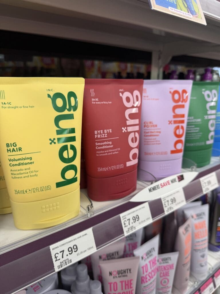
Now compare products rather than analysing each one individually.
Ask:
What makes something feel premium, mass-market or specialist?
Look at the visual codes being repeated across the category.
What colours keep appearing?
What kinds of typefaces?
Photography or illustration?
Glossy or matte?
Minimal or information-heavy?
Bright or restrained?
These are category codes: visual cues that help customers quickly understand what kind of product they’re looking at.
Then look for the brands breaking those patterns.The interesting question isn’t simply What’s different? But rather:
Why does being different work here?
The goal of packaging design for shelf appeal isn’t necessarily to shout louder than everyone else. Sometimes it’s understanding which category conventions need to be kept compared to where there’s an opportunity to behave differently.
STEP 04 — Look at product navigation
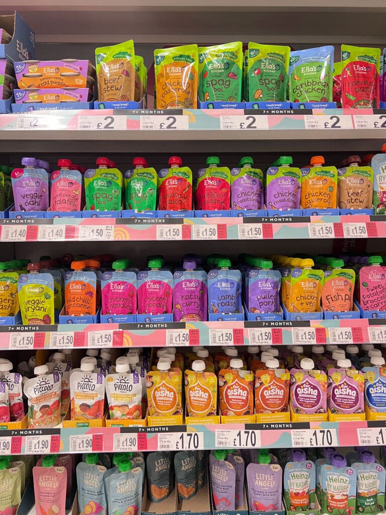
If a brand has several products or SKUs, study them together. How do you know which one is which?
Look at how the brand uses:
- Colour
- Typography
- Naming
- Numbers
- Illustration
- Photography
- Patterns
- Structural differences
A packaging system has to create consistency without making every product indistinguishable from the next.
This is one of the big differences between designing a beautiful pack and designing a packaging system. You’re not only designing one object. You’re creating a visual language that may eventually need to stretch across flavours, formats, product types and dozens of SKUs.
STEP 05 — Pick it up
Now try this:
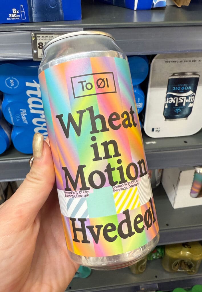
Pick up the packaging you instinctively want to pick up and ask yourself:
Why did I choose this one?
Then touch it, turn it around, feel the weight and the textures.
Notice:
- Materials
- Texture
- Finishes
- Weight
- Structure
- Opening experience
- How the design travels around the pack
- Details you couldn’t see from the shelf
Ask yourself:
Once it’s in my hand, what changes about this design? This is why I say packaging was never meant to live on a screen: its Hands, Hearts and Minds™️
You’re designing something people can eventually see, hold, turn, open and experience. Shelf appeal might be what makes someone notice the product, but the physical experience has to continue the story and live in the mind’s eye of the consumer long after purchase.
STEP 06 — Photograph three examples
Choose three pieces of packaging that teach these principles; yes choose the ones that you liked the look of, but also choose the ones that had lessons.
For each one, make a note of:
WHAT WORKS?
WHY DOES IT WORK?
WHAT DESIGN DECISION CREATED THAT EFFECT?
This is how you go from “I like this” to “I understand why this works.”
What does The Shelf Study teach you about packaging design?
Repeat this exercise often and you’ll start to see that successful packaging design for shelf appeal isn’t one simple decision, but a relationship between a series of decisions.
Shelf presence — What grabs attention from a distance?
Information hierarchy — What does the customer understand first, second and third?
Category codes — What makes the product recognisable within its category?
Differentiation — Where can the brand stand out, or do it differently without becoming confusing?
Product navigation — How easily can someone distinguish between products, variants and SKUs?
Materials and structure — How does the physical object contribute to the brand experience?
Systems thinking — Can the idea go beyond one beautiful pack into a coherent range?
This is why looking at packaging in the real world teaches you something that scrolling through packaging inspiration can’t. (And it’s why the 20k project mindset also exists.)
You’re not simply studying aesthetics and making things look cute: you’re studying decisions and consequences for the commercial viability of the brand.
Your final Shelf Study homework!
Before you leave, look at the category as a whole and ask yourself:
What would I do differently if I were designing for this shelf?
The point is to practise seeing opportunities like a cpg designer, not just a graphic designer. There’s a difference.
Why this exercise matters for brand designers
When you’re already a brand designer, learning packaging isn’t about throwing away everything you know and starting again.
It’s about learning to take your thinking further.
From strategy to identity to product to shelf to Hands, Hearts and Minds™️
The more you study packaging in context, the more you’ll begin to notice the decisions that aren’t obvious on a beautiful mock-up. Then try repeating The Shelf Study across completely different categories, too.
Coffee will teach you something different from skincare, supplements will teach you something different from chocolate, wine will teach you something different from cereal. CPG design as an ART and we won’t see it any other way.
This is what allows you to move beyond simply making packaging look good and start confidently solving the bigger brand problem around it.
That’s exactly the kind of thinking we teach inside Studio Expansion: The Brand & Packaging Design Course by Our Kind — in six-weeks you’ll learn professional packaging design and develop the strategic, creative, technical and commercial skills to take packaging projects from idea to shelf so you can solve your client’s biggest creative problems.